Mobile websites for 2014 and beyond
 Experts are predicting the “death” of the mobile web in 2014.
Wait a minute…what? Does that mean you don’t have to worry about what your website looks like on smartphones and tablets?
Exactly the opposite.
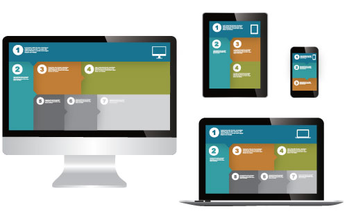
It means you have to start thinking beyond traditional mobile. You have to consider what your website is going to look like on every screen imaginable—from smartphones, to TVs, to screens that haven’t even been invented yet. The sky’s the limit on how “smart” everything is about to become.
Goodbye stand-alone mobile sites
The death of the mobile web means stand-alone, or dedicated, mobile sites (in which you redirect users from your desktop site www.example .com to m.example.com) will become dinosaurs in favor of a future-proof approach.
Why? While creating separate mobile sites allows you to tailor content, the approach comes with significant disadvantages:
- Maintaining two sites is inconvenient and can turn into a content management nightmare.
- Redirects, if not implemented correctly, could negatively impact your SEO.
- It creates a bad multiscreen experience. According to Google, “90% of people move between devices to accomplish a goal, whether that’s on smartphones, PCs, tablets or TV.” When you share a link from a mobile site, the site won’t render correctly on a different device.
Future-proof and integrate your website
Make things easier on yourself. Build one website that is easy to maintain, looks good on all devices—now and in the future—and provides users a good mobile experience. This can be achieved by using a solid CMS (content management system) and responsive design and/or dynamic serving.
Responsive web design (RWD)
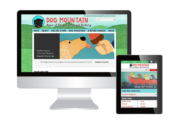
 RWD is currently the most talked about way to build a website that looks good on all devices. RWD serves the same HTML for one URL and uses CSS media queries to determine how the content is rendered on the client side. Flexible images and fluid grids are automatically sized to fit the screen.
Responsive design is all the rage these days. But…that doesn’t mean it’s the best choice for every website. Some of the disadvantages include:
- Truly responsive sites often have design limitations and aren’t tailored for a mobile experience.
- Sites tend to load slower as RWD serves the same HTML as the desktop site.
- Responsive design is often difficult to execute unless your site layout is fairly simple.
Dynamic Serving
 Dynamic serving allows you to deliver different mobile templates, or components, that are customized for a specific device, device capabilities and user intent. Adaptive web design and RESS (Responsive + Server Side Component) are two popular design approaches for what Google calls “dynamic serving.”
Popular CMS and e-commerce platforms such as Joomla, Magento and X-Cart use templates and modules to serve up device type-specific content that is rendered on the server-side—serving only what your visitors need for the best user experience.
Advantages of this method include:
- A site rebuild may not be required if your web platform is fairly current. A mobile module can be added to a preexisting site.
- Ideal performance across a multitude of devices.
- Faster load times as only required resources are downloaded for the user’s device.
One of the downsides of dynamic serving is you need to maintain multiple templates and create new templates for new devices.
Is your site mobile ready for 2014 and beyond?
Mobile website. Responsive. Dynamic. Adaptive...The terms are ubiquitous and used differently by different “experts.” They can be difficult to grasp. The important thing is that your website is manageable and gives your visitors the best experience possible on whatever device they’re using.
Need help integrating and future-proofing your site? Give us a call.