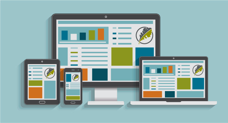
What does your website look like on a mobile phone? It’s now more imperative than ever to be sure your site is usable and appealing across devices. The tipping point has been reached -- in 2016, mobile overtook desktop as the primary device to access websites. In the U.S., out of the number of hours spent per day online, 51% are on mobile devices compared to 42% on a desktop or laptop. In response, web design experts have adopted responsive design as best practice from here on out.
If you haven’t taken the steps to optimize your site for mobile phones and tablets, you need to bite the bullet and get started. Investing in responsive design will lift up your business in a number of key ways.
Here are three concrete reasons to introduce your site to the world of responsive design:
1. Google is now “mobile-first” – as in, it ranks pages based on mobile versions of sites – not desktop ones.
Google knows that the majority of people searching the web are now doing so via their mobile phones. They want to give these users the best possible experience – so why would they direct them to a site set up for desktop view?
Since December 2017, Google has begun indexing mobile versions of sites instead of desktop versions. If you have a responsive site in place, there’s no need to worry. If you don’t, or if you have separate desktop and mobile sites, your search engine rankings could change.
Google rewards those websites that prioritize their users’ experiences no matter the kind of device they’re using. If you want your site to increase its ranking in search results – you need to adapt your website to current times.
2. Perception of your brand will improve.
In our world of fierce digital competition, a good impression can make or break a potential client or sale. It just makes good business sense to accommodate your customers’ needs. Without a responsive site that offers an easy experience on a mobile phone or tablet, you risk losing their confidence. An uneasy feeling might surface: if you’re not utilizing best practice in web design, where else are you cutting corners? Do you really value their time, when so much of it is spent trying to navigate a difficult-to-use site? Across industries, it’s so important to have a professional and modern website -- not only for optimal functionality, but also to maintain credibility and legitimacy with your customers.
3. You’ll reduce your bounce rate.
Visitors are 5 times more likely to leave a site if it’s not mobile-friendly. If the site loads on a small device and the text is not automatically accessible – if the user has to pinch and zoom in order to read any of the content – or it’s not easy to navigate or find what they are looking for, they’re not going to stick around.
Site speed is also becoming much more important, and another reason to build a modern, flexible site. 53% of mobile site visitors leave a page that takes longer than three seconds to load. They want to find their answer fast--and if your site doesn’t give it to them quickly, it’s easy enough to backtrack to the search results and find a website that does. Google knows this and considers page load speed when determining site rank. Yet another reason why it’s a good idea to exchange your bulky, desktop-focused site for a responsive one that is built for speed on mobile.
Looking for an experience for customers or employees that goes beyond a mobile website?
Some companies may decide they want a custom application built if they need functionality that is outside the scope of what can be done within a mobile website or a packaged app. Custom applications can be created to perform exactly the tasks that are needed, whether on mobile devices or computers. These businesses would benefit from a completely customized, flexible system that is built to solve their unique challenges. Functions can be integrated to work with existing websites and internal systems, performing relatively complex tasks or resolve processes.
The verdict is in – if your site is not responsive for all devices, now is the time to upgrade. Give your customers a pleasing experience and make it possible to rank higher in Google searches with an optimized site. You won’t regret it!
The Greenleaf Media team is happy to help with all of your web development or custom application needs. Reach out today to learn more!